Creating A Logo As a College Freshman
"Natalie, for your next project, I would like you to create the logo for the Center", asked my supervisor, Merith Weisman. Now, this would not seem like such a daunting task today, but when I heard this as a freshman nearly four years ago and after a month into working for the Center for Community Engagement (CCE), I was a bit intimidated by the fact that I would create something that would soon become the icon that would represent the office. As I am embarking on my last semester at Sonoma State University as an undergraduate, I wanted to write a blog post about the process of making the CCE's logo to reflect on one of my biggest and first accomplishments of working at the CCE. Like most organizations, we needed a logo to help people identify what we are involved in and also help make the CCE's presence more well-known. We were planning on launching several social media channels and we needed a consistent avatar. After my initial shock of being trusted with something so pertinent to my work, I immediately became brainstorming possible ideas. I looked through a countless number of examples of logos, examining every little detail that composed them. There were so many fonts, colors, and shapes to choose from; finding the correct combination that appropriately reflects the CCE would be my ultimate challenge.
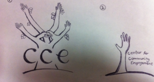
By the time of being assigned this task, I was fairly familiar with the goals and mission of the CCE and what we strive to accomplish. I wanted the design to encompass a symbol of unity, representative of the partnerships that the CCE builds and strengthens between local community organizations and Sonoma State University. I also thought to incorporate our priorities of diversity and sustainability. My first sketches included hands (which in hindsight turned out to look really creepy), trees with handshakes making up the branches, puzzle pieces and swirls. Eventually I began playing with the letters. I manipulated their sizes and shapes, turning them into abstract shapes that could be made out to read 'CCE'. I agreed with what Merith pointed out to me, I did not want one letter to be dominant over another.
I wanted to give equal weight for the letters that represent all three keywords for our office, "Center for Community Engagement". This is because I believe that all three components serve a direct purpose into the work we do on campus. We are a physical Center at the university that Engages the Community, as well as the university, in activities for the common good, which include integrating service-learning into classrooms and helping faculty with their scholarship by community-based scholarship. After revising it enough times and making the color scheme match the university's, I was confident in my final design. Sonoma State University's previous Provost, Eduardo Ochoa, even complimented the CCE's new logo, which definitely increased my excitement for what I had produced. This project truly made me feel more involved in the work that the CCE does and also made me feel like I was a part of Sonoma State University, which is undoubtedly critical for a first generation college freshman. I am grateful that I was given the opportunity to leave a lasting mark on the Center for Community Engagement for many years to come.

Author: Natalie Hambalek


